Showing posts with label Titling. Show all posts

Friday, 11 March 2016

Chayana's Analysis of Titles

Chayana's Analysis of Titles

Kill Bill

The title of the film immediately suggests action, as the word 'Kill' is a violent word that connotes death and revenge. It draws the audience in with the enigma that the title alone creates, as the audience is wondering who Bill is and why somebody wants to kill him. This ties to thriller as it uses enigma and the theme of death is a recurring theme throughout thriller. Moreover, the fact that the title rhymes, makes the name of the film memorable and makes it more likely that the audience will go and watch the film and therefore helps with the promotion and generates anticipation.


The first title to appear in 'Kill Bill' is 1:25 seconds in, and is introduced along with the sound of a gun shot. This alarms the reader, and causes impact as the shot before this is the shocking shot of blood splatting against the floor and it only last for a slip second. By placing the title in this place, it leaves the audience in a state of shock, but gives them time to digest the information the they were given in the scene, and changes the pace of the film, with the help of non-diegetic music that has a slow tempo, which creates contrast and makes the gun shot all the more shocking. 


This then leads into a sequence of titles that lasts for the next two minutes of the opening of the film, where the credits are shown on a black background with white writing until the last minute, where the titles are shown over a silhouette of 'The Brides' profile. Even then, the writing is white over black shadows. This is effective as it allows the audience to focus on the information that is being given, and black symbolizes power and darkness, while white symbolizes innocence and hope, so the important information being shown in white shows that the innocence and goodness is the important part to focus on, and should be the case throughout the rest of the movie.


The first bit of information presented is the director of the film, Quintin Tarantino, and the fact that this is his fourth film. This suggests that as the director of the films, this film is connected to his other pieces of work, and this is like a another book.


The second piece of information shown is the leading actress's name, which is 'Uma Thurman'. In this section of the credits, she is the only actor mentioned before the name of the film. This shows that she is the main protagonist of the film and is the most important person to follow.


Throughout the sequence, the font and the font size are consistent, apart from the title of the film, which is bigger than the rest of the credits, as it is the most important piece of information. The other time the font differs is when introducing a new category for the credits.

Deadpool 

The opening of the movie Deadpool is set up to be a continuous shot that pan through a car crash that lasts 2 minutes. The sequence starts with an ECU of bullet that pans out to show a man with a very distressed expression and a mark on his head that suggests that it was him who got shot with the bullet. It also introduces 'Twentieth Century FOX' as the studio that produced the movie.

The shot then pans out to a shot through the lid of a coffee shot, and coffee mid air. This shows that this sequence is a freeze frame and that we are navigating through the scene, as liquid cannot be suspended in the air, so we understand the nature of the shot. In this shot, we are also shown that it is in association to Marvel Entertainment, which again, is seemingly normal

Then we are introduced to the next title. In the shot, there is a man holding a gun, which suggest the danger. However, the credit say 'Some Douchbag's Film', rather than crediting the actual owner of the film. This sets up the nature of the film, as the film is supposed to be dramatic and full of fighting, which would include guns, but it also shows that the film is comedic and is poking fun at itself. This continues throughout.


The first name of the actor's is 'God's perfect idiot', which is proceeded by a shot of a magazine cover that shows the lead actor on the cover of a magazine being called the sexiest man alive. This is a real article that was published in 2010, as seen by the article showing Prince William and Kate Middleton's engagement. 


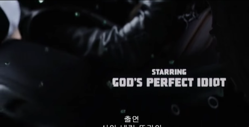
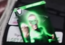
Once more, this is breaking the fourth world, showing that the movie is acknowledging that the actor exist in this universe as an actor. Another example of this when a card with 'The Green Lantern'  passes on the screen. This was acknowledging the fact that the actor playing the character had played a super hero previously. moreover, it was a superhero from Marvel's 'rival' DC.

 
The other listings of actors then begin to list stereo types of people you would usually find in movies, such as 'A Hot Chick', 'A British Character', 'A Moody Teenager', 'A CGI Character', 'The Comic Relief', etc. which is all happening with a dramatic background with explosions and weapons. this is pointing an accusatory finger at the audience, saying that they wouldn't care who was playing these characters, as long as they were in there. It is again very comedic.


Even the higher stages of the production are made fun of in the intro, the producers being called 'Asshats,' and the director being called an 'Overpaid Tool'. This shows that everybody involved in the film had a good sense of humor, and was not taking themselves seriously.

The only people 'credited' here who are really shown in a good light, are the writers, which suggests that it was their idea to put this in the title as they praise themselves. it also points another finger, saying that the writers of films rarely get noticed, but they do a lot of hard work.


The point of having a opening 'credits' that didn't properly credit anybody, was to set up the nature of the film, which was one that parodied other films, itself, and broke the fourth wall as comedic devices to create an unorthodox comedy that is unique. Moreover, it also created interest, by showing gradually showing fractions of an action scene and gets the audience asking questions about how they got into that situation.


Titling


The original design for the production company logo. We used the first letters of each of our names and kept it on a simple black background.


The original design for the title of our "A Casual Affair". We used the name because it was ironic to the plot of the film where the woman cheats on her husband several times and neither of them cope with the situation very well. We wanted to create the essence of a wedding invitation with the curly font to further the irony and decided, with a bit of feedback, that it would be better with a border around it. 


 The photos above show Chayana and Natasha discussing the best way to create the border to create the effect we wanted. We had to be careful to make sure that the border didn't overpower the font. We kept it on a simple black background to show the evil within both characters whilst they both try to remain the facade of innocence in front of each other.

Audience Feedback: Melissa's 20 year old brother, Joshua.


Melissa asked him is it was clear what we were trying to achieve which replied to saying that it was.

Melissa's Analysis of Titles


Sherlock Holmes


The title Sherlock Holmes communicates to the audience that this film is a Thriller because they recognise the character from the famous set of detective novels by Sir Arthur Conan Doyle. This creates interest as people wish to see how the stories have been interpreted because of how well known they are.


The logos of the production companies appear right at the start as a part of the setting. Quiet, non-diegetic music can be heard as light shines on the logos (as though a torch were being shined searching for clues) this adds to a sense of mystery as they contrast with darkness and the music adds an eerie feel.


Light shining on logo. It is a part of the setting,


Diegetic sounds of horse and carriages along with a shadow which passes over one of the logos communicates to the viewer the Victorian time period in which the film has been set. It also creates mystery because the viewer does not know who is in the carriage or why it is there.

Shadows appear over the logo as horse and carriage move past making it part of the action


From the production company logos, the camera tilts up as the horse and carriage goes past, again, communicating the idea of Victorian England as the sequence begins. No character names are introduced throughout this sequence, leaving it an enigma. The non-diegetic music is sustained but then fades away and is replaced by the diegetic cries of the horses and carriage movement.

 
The sequence begins after a tilt up from the production companies

The title originally appears as a subheading on a newspaper, using a font to look like typewritten. It starts of as part of the newspaper which communicates the use of how news is spread, setting the time period. Crimes are often reported in newspapers which shows the viewer that the characters are detectives. It also conveys to them that there will be lots of crime and mystery in the film, representing common features of the Thriller genre. The non-diegetic music crescendos as this happens, adding a shock effect on the audience as it takes them by surprise. It is also a similar theme to the one being played as the production companies were being shown at the beginning, separating it from the story.

When the titles do appear, they introduce the character from the previous sequence to be the protagonist, Sherlock Holmes, through the use of a photograph from the previous sequence being linked to the subheading. However, the title is only used as a subheading and the “killer” in the main heading is remained nameless, adding mystery for the audience.

The shot from sequence being used to introduce the characters and titles

 The title then fills up the centre of the screen, remaining in the typewritten font on the yellowed newspaper background as the rest of the text dissolves away. This shows the audience the key subject of the film but also how popular the character is in the story which could add mystery when a villain is involved. The title remains in the centre and, though the font is bold, the edges of the screen are fading into darkness, putting it in the spotlight, showing that the character does not know much about the situation which is about to occur whilst they are the centre of attention. 

Titles bold, typewritten and fill up centre of screen. The text is fading in background of yellowed newspaper. Edges are darkened


From the titles itself, there is a bright white flash and a camera flash sound effect and the titles are replaced by a street sign which is the famous street that the character of Sherlock Holmes lived on. This is significant because it sets the story for the audience which contrasts with the previous sequence of action and does not reveal any more information from it. The non-diegetic music then fades away.

Bright flash to transition to main sequence

Source Code


Production company logos appear on a black background with the non-diegetic soundtrack running over the top of it.  This music runs throughout the opening credit sequence which engages the audience as it introduces the action. The music crescendos followed by it being very quiet when the sequence begins, creating a shock effect on the viewer which then informs them that this is a Thriller film.

The non-diegetic music is tense and crescendos throughout. It also resembles the sound of a train with the brass. All the establishing shots follow the track of the train around the city which informs them of the main subject of the story. The music adds suspense and tension which leaves the audience thinking that something is wrong, creating an enigma.

The production companies then flicker and appear in the bottom left-hand side of the screen which makes it look like a computer screen flickering. They then stay on screen for another couple of seconds before clearing out, making it easy for the viewer to read them. This lets them focus on the action happening in the background.

Production companies flicker in the bottom left hand side of the screen


The names of actors appear in a similar way but they also appear in bottom centre and right of the screen, making it interesting for the viewers.

Actors names appear on the bottom centre of the screen


The title also appears in the same way as the actors and the production companies did. However, a line runs underneath it like a train track. This lets the audience know that the train is the main focus without peeling the attention away from the action happening behind. The titles are white with a black outline which makes them clear and easy to read as the background changes.

The title appears and a line runs along the bottom like train tracks


After the title appears, more production companies and the music producers are mentioned, along with editors. This shows takes the focus away from the titles, hiding it’s significance from the viewer, making it a mystery.


The name Source Code makes the audience think of computers which creates an enigma because it leaves the audience wondering why the train is so important. This lets them know that this is a Thriller film because they realize that something can’t be right. 


Skyfall


The sequence begins with no introduction to any characters and only diegetic sound. An enigma is created when the dialogue says “agent down” because the audience doesn’t know who or why and is left guessing.

"Agent down". The characters and situation is unknown to the viewer.


 The non-diegetic music begins when a character falls down the waterfall. This then begins to separate the credits from the actual story of the film. The music has its own soundtrack which lasts the entire 4 minutes.

The sequence appears to start as his face comes into shot and he starts to drown.
The production companies appear centre screen, followed by the lead actor and the author of the 007 books. This makes it clear to the audience that this is separate to the story happening previously.

The lead actors name appears as a hand drags the character down, separating the sequence from the main storyline.
The titles appear small in the centre of the screen as it appears that the main character is falling down, making it symbolic. The titles look faded and broken which connotes the sense of death and something being wrong, creating mystery and suspense for the viewer. The size of the font make them seem overwhelmed in the vastness of the sea surrounding it, making them seem vulnerable. They are also on screen for a very short period of time before fading out, as if the character is also fading out of existence.


The titles appear in the middle as the protagonist is being swallowed by the ocean floor.


The idea of a Thriller is communicated by the use of symbolism in the background behind the title sequence. There is lots of imagery of death, weapons and blood which are all very common features of Thriller movies.

An example of the symbolism of death
An example of the symbolism of weapons


The colours of the credits change frequently to ensure that they are readable by the audience whilst the action in the background changes. It also provides interest for the viewer, keeping them engaged.


An example of the frequent change in the colour of the font.


At the end of the sequence, the name of the director appears in the centre of the protagonist's eye, as though they were introducing the film.

The director's name in the centre of the protagonist's eye to end the sequence and introduce the rest of the film


The name Skyfall creates a sense of the end of the world and disaster, which creates the sense of a Thriller film because it makes the audience wonder whether there will be a state of equilibrium or peace for the protagonist at any point.

Friday, 4 March 2016

Tasha's Titling Task


Rear Window

The film title the 'Rear Window' suggests that the film is a thriller due to the fact that the title lets the spectators believe that its based on secretiveness. This is because of the words used in the title; the word 'Rear' means the back of something and obviously a 'Window' is something u can see out of. So by the title being called the 'Rear Window' suggests that the film is centred about looking through this particular window. This may create enigma within the audience as they will want to know more about the film and why the title is called this.
        
The layout and design of the title includes it being centred in the middle of the screen with the directors name above the title. This suggests to the audience that the filmmakers aren't that focused on the name of the film standing out. As it seems they care a lot about including famous names as well. The style of the title seems to be a very basic font that is bold in a light beige colour with red outlining it. Overall, this suggests that the style and visual appearance of the title isn't that important in the eyes of the filmmakers. Considering this was made in the mid fifties proves that their opinions and concepts of the visual style of films as different to what we think today.                

 The institutional information included the logos and short sequences of the production companies involved. For instance, at the very beginning of the sequence 'Universal' appeared on the screen along with its iconic soundtrack playing with it. This then faded to black and was followed by 'Paramount' presenting their logo into the sequence. Both these production companies have very iconic soundtracks and visual elements to them which are well known to the audience. These two sequences took up a good amount of time which could have been used to help emphasise the film. However, when considering the time period I think that this was an important thing to include to help promote how important these production companies are for filmmakers back in this time periods. Whereas nowadays the production companies are only shown very briefly in the opening credits as filmmakers care more about including as much elements of their own film as they can.    

When considering the sound included in this sequence; throughout there is a continuous loop of a jazz song playing. This helps create a continuous mood throughout which also creates a generally balanced pace and vibe for the audience to feel.