Friday, 4 March 2016

Tasha's Titling Task

Shutter Island


The name of the film 'Shutter Island' suggests that the film might be about being trapped or isolated, as the word 'Shutter' means to close something in for either security or privacy. Whereas, the word 'Island' is something that is isolated and secluded, this title therefore connects to the genre of thriller as the thriller genre is known for being mysterious and containing a sense of suspense. Therefore, I think this film title relates to the spectators as they will all be able to emphasis with the feeling of wanting to be alone and having privacy at one point or another in their life. Whereas, for the target audience, the title will create anticipation and wonder as they will want to know what the film is about due to the mysterious and deceiving name of the title.


The design of the film title is very bold and dramatic; the use of the colour red is a very commonly used colour as red is stereotypically iconic for a thriller film. This is because it connotes meaning of anger, blood, death etc. The fact that the text is positioned onto a black background makes it even more noticeable and abrupt. Due to the association with red relating to death and evilness, the fact that the all of the words are red suggest to the spectators that 'Shutter Island' is a dangerous place. 


As the credit sequence continues to play various institutional information is presented on screen. For instance, 'A film by Martin Scorsese' is presented as zooms into a shot of an abandoned location. The location shown is very dark and bleak, contrasted with the bold red text of the institutional information. This emphasises the thriller conventions as the lighting is very dark and gloomy with red being a predominant colour to use.


As the credits continue other institutional information is shown in the colour white; throughout the credits the colour goes back and fourth between the colours red and white. This could be symbolic to the fact that red represents evil while white represents purity.


The sequence is supported with a range of various superimposed shots of the location; informing the viewers where the film is set but also giving them a glimpse of what the film involves.


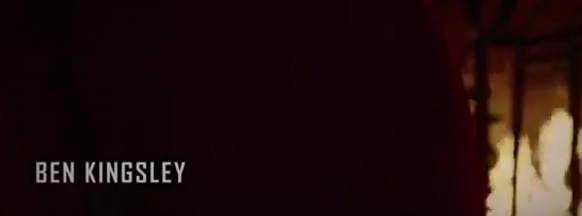
 As the sequence develops three actors are introduced, there are obviously more actors involved in the film but the filmmakers only put three of the actors in the opening credits as these are the most famous actors in the film.  They are introduced into the sequence through superimposed shots of the location and then appear on the screen for a few seconds in bold white text, positioned on the left hand side of the screen.


In relation to the order of the information presented, the main institutional information is shown first. For example, the production company's involved and the director. Then the main actors names appear alongside with more institutional information including who's involved in the making of the film etc.
 Sound included:
The opening credits start with non-diegetic background music playing; the music is full of suspense and mystery. The music tends to vary from a high and low pitch creating uneasiness amongst the viewers.  Towards the end of the sequence there is an establishing shot of an island which then fades to black, where the title starts to slowly increase in size. As this is happening the music increases in crescendo, building up pace and tension. Therefore, creating this suspense amongst the viewers which is an iconic element of a thriller. This is due to the fact that a thriller is full of uncertainty.


Tasha's Titling Task


Panic Room

The name of the film 'Panic Room' suggests the genre is a thriller as the definition of 'Panic' means to have sudden uncontrollable fear or anxiety, often causing wildly unthinking behaviour. These types of emotions and feelings that are often associated with a thriller. Especially as a thriller is normally very unexpected and unpredictable. I think the name of the film connects with the audience as they will have at least one time or another experienced the feeling of being panicked. Some may even relate to the fact of having an actual panic room to go to when they need to relax and calm down. Furthermore, I think that by naming the film 'Panic Room' it suggests to the target audience that the film is about an actual panic room or that it could be a metaphor for something else. This therefore sparks interest and enigma within the target audience.

The film title suggests that the genre is a thriller through the design and structure of the title itself. For example, the colouring resembles a grey/silver tone; this relates to the dark, gloomy atmosphere that is within a thriller film. Whereas, if the genre was romance, the colouring would probably be pink or red which are the colours that connote love. The font and animation of the title resembles a steel-like structure, that consists of bold metallic letters. This suggests that because the words 'Panic Room' are formed this way, that if there is an actual panic room in the film then it will also be structured in the same style. When analysing the composition of the film title, each letter is placed equally apart in the centre of the screen. The background consists of a series of tall skyscrapers compacted closely with one another; resembling the scenery of a city such as New York. So the fact that the film might be set in a busy crowded city like New York, suggests the reason why there may be a panic room involved in the story, is to get away from the frantic overwhelming atmosphere that New York brings with it.  


Institutional Information included:

At the beginning of the opening credits the spectators are presented with the famous logo 'Columbia' from Sony Pictures Entertainment company. Showing that this is the production company that is involved with this film.


As the logo fades to black the credit sequence shows a series of shots of the setting in New York. As the shots change various institutions appear on screen; 'A Hofflund/Polone Production', 'An Indelible Picture'. These institutions are all in the same design as the title itself; bold silver/grey fonts resembling a statue or ornament that is significantly large in comparison to the scenery in the background of the titling. This layout of the text may be just to go alongside the whole style of the credit opening. However, the largeness of the texts could be used to emphasise how important and powerful these production companies are.


Before the actual film title appears on screen, various actors names are presented in the sequence. I think the reason why some of the actors names are presented before the actual film title is because they are very famous actors. So by doing this the film makers know that this will grab the spectators attention, as they will be informed at the very beginning who is in the
film.


When considering the sequence as a whole I think the use of scenery for the background is very affective and informs the audience clearly the location where the film is set (in this case New York). The location set is affective for a thriller as New York contains an atmosphere of chaos and uncertainty; iconic for a thriller. I also think by the title and the other additional information being the same design layout, it creates the theme of continuity and consistency.


Sound included:


At the beginning of the opening sequence the Sony Pictures Entertainment company logo is the first visual element to appear on screen. As the short sequence for the logo develops, a sound bridge is used; where the music from the next sequence overlaps onto the sequence being shown. The shot then fades to black and the next sequence begins playing alongside the music. The background music playing is combined with both diegetic and non-diegetic sounds. For example, the part where a sound bridge is used contains mainly diegetic noises of traffic and sirens. However, as the sequence develops non-diegetic music is edited amongst the other noises.


Thursday, 18 February 2016

Making the Fake Blood

Making the Fake Blood

In our movie opening, our character are covered in bruises and blood all over them. Because of this, we had to obtain some fake blood. We thought about buying it and we researched some ready made ones and worked out the average price.

We decided that the price ranges were good value and that we wouldn't mind buying them if we needed to. We then searched through them and looked through the reviews to see if any of them stained clothing.

However, in the end we decided that the package if we were going to buy it on a website like Amazon, it might arrive too late, and we wouldn't want to wait for it to come.

After we decided this, we started looking up recipes for making blood. In the end we found this website that had several recipes.

There we other websites and tutorials that had videos and pictures, but we chose this website because it had the method that used the more attainable ingredients and easier method.

The Ingredients and Utensils
  • Golden Syrup
  • Water
  • Red Food Colouring
  • Flour (to thicken)
  • A Bowl
  • A Spoon


Method
  1. First, we put a tablespoon of Golden Syrup into a bowl.
  2. We then added two table spoons of water to the golden syrup and mixed them together.
  3. After the mixture was a good consistency, we added the red food colouring.
  4. When we mixed the red food colouring in, we then added some flour to make the mixture thicker.
  5. After, we decided that we would need more blood, so we added more water and golden syrup. 
When we finished mixing it, we left it to become thicker, like the website said to so that we were able to use it on the props, and add it to the make up that was already being put on.

After a couple of minutes, the mixture seemed stiffer, so Chayana tried it on her skin, as shown on the picture to the left. We thought that it looked realistic and it was good to use. We also made sure that it was easy to get off, and Chayana was able to get it off easily with water, which was good.


Here is a video of us making the Blood

On Set


Make Up and Costume

We asked Niamh to help create the cuts and bruises and blood effects and well as helping create the rips in costume. 

Niamh after doing the stage makeup on Emily 
Tash going over Emily's makeup before applying the stage makeup
Emily's arm after the during adding the stage makeup

Niamh applying makeup to create the bruises on Emily
Niamh applying stage makeup to create the effect of scratches on Will's arm

The final result after applying stage makeup
to Will
The final result after creating rips and applying
stage makeup to Emily


These photographs of the final results actors helped us when we needed to film on another to day so that the makeup and costumes stayed consistent throughout. Fortunately, we only needed the full photograph of Emily as she was the only actor needed on the second day of filming. 


Niamh applying stage makeup to Sam's hoodie to create the effect of being stabbed.

The final result of Sam's costume

Filming On Set

We each swapped around roles during filming.

Chayana using the boom mic and sound recorder, making sure the microphone isn't in shot and that the sound can be heard.

Tash composing the shot, making sure that both actors will be in the centre of the frame for the two-shot. The positions marked with tape.

Melissa after setting the white balance.


Chayana and Tash checking the recordings after filming the shot


Melissa operating the camera, Chayana operating the lighting and Tash directing the actor and helping Melissa compose the shot


The set up of the forest scene
Melissa experimenting after watching this video. Chayana operating the lights. 
This was one of the hardest shots we did. We wanted to create a still high angle, over the shoulder shot of the character staring out of the window followed by a smooth tilt downwards to the photographs on the table as the actor walks out of shot.

Our issue was that the camera was not close enough to be clear and the zoom didn't create the look that we wanted. So we watched the video in the caption above and tried to recreate it.

To make sure that the camera was still for the over the shoulder shot and that the leg of the Tripod didn't get stuck on the floor (which it did during the tilt), Chayana operated the camera whilst Melissa sat on the floor out of shot, ready to lift and steady the leg for the tilt downwards and Tash operated the lights. 


Emily filming whilst Tash directs and Chayana creates the dragging effect
For this shot, we wanted to create the effect that our protagonist was remembering being dragged through the woods so we wanted a handheld tilt down to her feet whilst moving. At first, we debated lying down on a skateboard but decided against this because it wouldn't create the effect that we wanted.

So, what we did was lay down a shower curtain with a blanket on top. We showed Emily what button recorded and Melissa preset the white balance. Chayana pulled the shower curtain a short way across the bridge whilst Emily created the handheld tilt. Tash directed the shot. 

The Equipment

The Equipment


For filming and recording we used:
  • 1x Boom Mic
  • 1x Voice Recorder
  • 1x Camera
  • 1x Battery Powered LED Light
  • 1x Tripod


However, we had a slight issue with the boom mic. The microphone stand wouldn't attach to the end of the pole: 


We overcame this situation by using layers of tape to secure it in place.


We also used:
  • Homemade Fake Blood
  • 1x Whiteboard (as a makeshift clapperboard)
  • 1x Knife
  • Polaroid Photographs

We would write the shot number (which we took from our story board), the take number, and the shot size on the board and held it in front of the camera before each shot so that it would be easy to find each shot during editing.


To make the fake blood, we used the top recipe on this website.


Mixing the Water, Syrup, Food Colouring,
and Flour together.


A bowl, Golden Syrup, Red Food Colouring
Water, Flower, Spoons, Jug, Brush.


The final result. The blood was
used on the knife and on "John's"
arm at the sink.


Wednesday, 17 February 2016

Discussion

After Filming Discussion

Shortly after filming on our final day, we sat down and discussed what we thought went well during filming, what could have gone better, whether it met our expectations, and the issues we faced.


White Balance

The White Balance


To make sure that the colouring of our footage stayed true throughout, we constantly set the white balance by using the 'one push' setting on the camera every time we changed location but also when we moved the camera around the room.

This is because (especially during the kitchen scene) the main source of lighting changed frequently. From one angle, the main source of lighting would be the natural light coming through the window and, from another angle, it would the overhead light in the room.

To make sure that our white balance was set, we would hold up a pad of plain white paper for the setting to work:
Chayana setting the white balance
There were a couple of times where we had issues with the white balance. For example, with the kitchen scene, as stated previously, the main sources of light frequently changed, meaning that after filming one shot, we would find that the footage had an orange quality to it which contrasted with the previous shot so we would have to reset the white balance and re-do the shot. This added to our time.