Friday, 11 March 2016

Melissa's Analysis of Titles


Sherlock Holmes


The title Sherlock Holmes communicates to the audience that this film is a Thriller because they recognise the character from the famous set of detective novels by Sir Arthur Conan Doyle. This creates interest as people wish to see how the stories have been interpreted because of how well known they are.


The logos of the production companies appear right at the start as a part of the setting. Quiet, non-diegetic music can be heard as light shines on the logos (as though a torch were being shined searching for clues) this adds to a sense of mystery as they contrast with darkness and the music adds an eerie feel.


Light shining on logo. It is a part of the setting,


Diegetic sounds of horse and carriages along with a shadow which passes over one of the logos communicates to the viewer the Victorian time period in which the film has been set. It also creates mystery because the viewer does not know who is in the carriage or why it is there.

Shadows appear over the logo as horse and carriage move past making it part of the action


From the production company logos, the camera tilts up as the horse and carriage goes past, again, communicating the idea of Victorian England as the sequence begins. No character names are introduced throughout this sequence, leaving it an enigma. The non-diegetic music is sustained but then fades away and is replaced by the diegetic cries of the horses and carriage movement.

 
The sequence begins after a tilt up from the production companies

The title originally appears as a subheading on a newspaper, using a font to look like typewritten. It starts of as part of the newspaper which communicates the use of how news is spread, setting the time period. Crimes are often reported in newspapers which shows the viewer that the characters are detectives. It also conveys to them that there will be lots of crime and mystery in the film, representing common features of the Thriller genre. The non-diegetic music crescendos as this happens, adding a shock effect on the audience as it takes them by surprise. It is also a similar theme to the one being played as the production companies were being shown at the beginning, separating it from the story.

When the titles do appear, they introduce the character from the previous sequence to be the protagonist, Sherlock Holmes, through the use of a photograph from the previous sequence being linked to the subheading. However, the title is only used as a subheading and the “killer” in the main heading is remained nameless, adding mystery for the audience.

The shot from sequence being used to introduce the characters and titles

 The title then fills up the centre of the screen, remaining in the typewritten font on the yellowed newspaper background as the rest of the text dissolves away. This shows the audience the key subject of the film but also how popular the character is in the story which could add mystery when a villain is involved. The title remains in the centre and, though the font is bold, the edges of the screen are fading into darkness, putting it in the spotlight, showing that the character does not know much about the situation which is about to occur whilst they are the centre of attention. 

Titles bold, typewritten and fill up centre of screen. The text is fading in background of yellowed newspaper. Edges are darkened


From the titles itself, there is a bright white flash and a camera flash sound effect and the titles are replaced by a street sign which is the famous street that the character of Sherlock Holmes lived on. This is significant because it sets the story for the audience which contrasts with the previous sequence of action and does not reveal any more information from it. The non-diegetic music then fades away.

Bright flash to transition to main sequence

Source Code


Production company logos appear on a black background with the non-diegetic soundtrack running over the top of it.  This music runs throughout the opening credit sequence which engages the audience as it introduces the action. The music crescendos followed by it being very quiet when the sequence begins, creating a shock effect on the viewer which then informs them that this is a Thriller film.

The non-diegetic music is tense and crescendos throughout. It also resembles the sound of a train with the brass. All the establishing shots follow the track of the train around the city which informs them of the main subject of the story. The music adds suspense and tension which leaves the audience thinking that something is wrong, creating an enigma.

The production companies then flicker and appear in the bottom left-hand side of the screen which makes it look like a computer screen flickering. They then stay on screen for another couple of seconds before clearing out, making it easy for the viewer to read them. This lets them focus on the action happening in the background.

Production companies flicker in the bottom left hand side of the screen


The names of actors appear in a similar way but they also appear in bottom centre and right of the screen, making it interesting for the viewers.

Actors names appear on the bottom centre of the screen


The title also appears in the same way as the actors and the production companies did. However, a line runs underneath it like a train track. This lets the audience know that the train is the main focus without peeling the attention away from the action happening behind. The titles are white with a black outline which makes them clear and easy to read as the background changes.

The title appears and a line runs along the bottom like train tracks


After the title appears, more production companies and the music producers are mentioned, along with editors. This shows takes the focus away from the titles, hiding it’s significance from the viewer, making it a mystery.


The name Source Code makes the audience think of computers which creates an enigma because it leaves the audience wondering why the train is so important. This lets them know that this is a Thriller film because they realize that something can’t be right. 


Skyfall


The sequence begins with no introduction to any characters and only diegetic sound. An enigma is created when the dialogue says “agent down” because the audience doesn’t know who or why and is left guessing.

"Agent down". The characters and situation is unknown to the viewer.


 The non-diegetic music begins when a character falls down the waterfall. This then begins to separate the credits from the actual story of the film. The music has its own soundtrack which lasts the entire 4 minutes.

The sequence appears to start as his face comes into shot and he starts to drown.
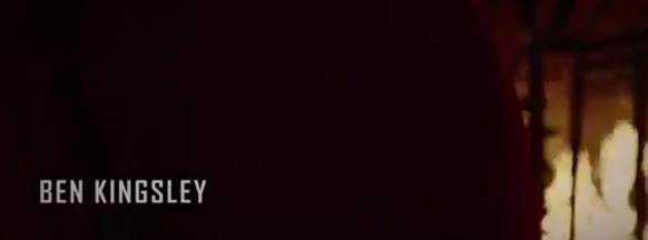
The production companies appear centre screen, followed by the lead actor and the author of the 007 books. This makes it clear to the audience that this is separate to the story happening previously.

The lead actors name appears as a hand drags the character down, separating the sequence from the main storyline.
The titles appear small in the centre of the screen as it appears that the main character is falling down, making it symbolic. The titles look faded and broken which connotes the sense of death and something being wrong, creating mystery and suspense for the viewer. The size of the font make them seem overwhelmed in the vastness of the sea surrounding it, making them seem vulnerable. They are also on screen for a very short period of time before fading out, as if the character is also fading out of existence.


The titles appear in the middle as the protagonist is being swallowed by the ocean floor.


The idea of a Thriller is communicated by the use of symbolism in the background behind the title sequence. There is lots of imagery of death, weapons and blood which are all very common features of Thriller movies.

An example of the symbolism of death
An example of the symbolism of weapons


The colours of the credits change frequently to ensure that they are readable by the audience whilst the action in the background changes. It also provides interest for the viewer, keeping them engaged.


An example of the frequent change in the colour of the font.


At the end of the sequence, the name of the director appears in the centre of the protagonist's eye, as though they were introducing the film.

The director's name in the centre of the protagonist's eye to end the sequence and introduce the rest of the film


The name Skyfall creates a sense of the end of the world and disaster, which creates the sense of a Thriller film because it makes the audience wonder whether there will be a state of equilibrium or peace for the protagonist at any point.

Audience feeback on our thriller opening


 Emily's feedback of our thriller opening:

She suggested that we play the background music throughout the sequence up to the dialogue and that we quieten it down gradually.

She also said that in one part of the opening when it fades to black that we shouldn't have it as black for so long to keep it short and dramatic.


Joshua's Feedback


An interview between Melissa and her 20 year old brother, Joshua:

M: So now that you've watched the final piece, was it clear that the flashbacks as the main character was running were flashbacks?


J: Yes, it was clear. The effects you used really separated it from the running scene.

M: And the music we used while she was running, was it too dramatic?

J: No, I don't think so. In films like this, you need it to be dramatic to get the audience feeling tense too.

M: At the end of the film, we wanted to use soft piano music and the titles as a sort of wedding invitation as ironic, did that come across okay?

J: Yeah, it was fine. 

M: And after he lifted up the knife, there was a fade to black and you could hear her fall to the floor. When we started this, we found it rather comical, did you think so?

J: No, I didn't think so.

M: Is there anything you would improve on?

J: The last shot when it tracks up her arm, I wouldn't have moved the camera with the zoom. I would have started with the wound, then revealed her face to create a shock on the audience. I would have also had her entire hand out flat on the floor, even though it's not a very realistic position for a dead body to be in, just to make it really clear to the audience that it was a wedding ring. Films usually tend to give the audience the information straight away instead of having to give them a moment to figure it out for themselves.

Also, at the beginning, instead of having her keep looking back and forth from the knife, I'd have done it once then had shots from the knife and the dead body.

M: So a bit more match on action and a bigger shock at the end, then? Thank you, I think we'll take that on board for next time. Is there anything else you would like to add?

J: I think that maybe you tried to fit a lot of action into 2 minutes. I think if you were to do this again, I would keep it to its most basic elements to give you more chance of fitting in more shots (like establishing shots) instead of having to worry about making sure that you fit in each thing a character does. 

M: Perfect! Thank you so much for your help.


Casual Affair - Movie Opening

A Casual Affair - Movie Opening


Friday, 4 March 2016

Tasha's Titling Task


Rear Window

The film title the 'Rear Window' suggests that the film is a thriller due to the fact that the title lets the spectators believe that its based on secretiveness. This is because of the words used in the title; the word 'Rear' means the back of something and obviously a 'Window' is something u can see out of. So by the title being called the 'Rear Window' suggests that the film is centred about looking through this particular window. This may create enigma within the audience as they will want to know more about the film and why the title is called this.
        
The layout and design of the title includes it being centred in the middle of the screen with the directors name above the title. This suggests to the audience that the filmmakers aren't that focused on the name of the film standing out. As it seems they care a lot about including famous names as well. The style of the title seems to be a very basic font that is bold in a light beige colour with red outlining it. Overall, this suggests that the style and visual appearance of the title isn't that important in the eyes of the filmmakers. Considering this was made in the mid fifties proves that their opinions and concepts of the visual style of films as different to what we think today.                

 The institutional information included the logos and short sequences of the production companies involved. For instance, at the very beginning of the sequence 'Universal' appeared on the screen along with its iconic soundtrack playing with it. This then faded to black and was followed by 'Paramount' presenting their logo into the sequence. Both these production companies have very iconic soundtracks and visual elements to them which are well known to the audience. These two sequences took up a good amount of time which could have been used to help emphasise the film. However, when considering the time period I think that this was an important thing to include to help promote how important these production companies are for filmmakers back in this time periods. Whereas nowadays the production companies are only shown very briefly in the opening credits as filmmakers care more about including as much elements of their own film as they can.    

When considering the sound included in this sequence; throughout there is a continuous loop of a jazz song playing. This helps create a continuous mood throughout which also creates a generally balanced pace and vibe for the audience to feel.

Tasha's Titling Task

Shutter Island


The name of the film 'Shutter Island' suggests that the film might be about being trapped or isolated, as the word 'Shutter' means to close something in for either security or privacy. Whereas, the word 'Island' is something that is isolated and secluded, this title therefore connects to the genre of thriller as the thriller genre is known for being mysterious and containing a sense of suspense. Therefore, I think this film title relates to the spectators as they will all be able to emphasis with the feeling of wanting to be alone and having privacy at one point or another in their life. Whereas, for the target audience, the title will create anticipation and wonder as they will want to know what the film is about due to the mysterious and deceiving name of the title.


The design of the film title is very bold and dramatic; the use of the colour red is a very commonly used colour as red is stereotypically iconic for a thriller film. This is because it connotes meaning of anger, blood, death etc. The fact that the text is positioned onto a black background makes it even more noticeable and abrupt. Due to the association with red relating to death and evilness, the fact that the all of the words are red suggest to the spectators that 'Shutter Island' is a dangerous place. 


As the credit sequence continues to play various institutional information is presented on screen. For instance, 'A film by Martin Scorsese' is presented as zooms into a shot of an abandoned location. The location shown is very dark and bleak, contrasted with the bold red text of the institutional information. This emphasises the thriller conventions as the lighting is very dark and gloomy with red being a predominant colour to use.


As the credits continue other institutional information is shown in the colour white; throughout the credits the colour goes back and fourth between the colours red and white. This could be symbolic to the fact that red represents evil while white represents purity.


The sequence is supported with a range of various superimposed shots of the location; informing the viewers where the film is set but also giving them a glimpse of what the film involves.


 As the sequence develops three actors are introduced, there are obviously more actors involved in the film but the filmmakers only put three of the actors in the opening credits as these are the most famous actors in the film.  They are introduced into the sequence through superimposed shots of the location and then appear on the screen for a few seconds in bold white text, positioned on the left hand side of the screen.


In relation to the order of the information presented, the main institutional information is shown first. For example, the production company's involved and the director. Then the main actors names appear alongside with more institutional information including who's involved in the making of the film etc.
 Sound included:
The opening credits start with non-diegetic background music playing; the music is full of suspense and mystery. The music tends to vary from a high and low pitch creating uneasiness amongst the viewers.  Towards the end of the sequence there is an establishing shot of an island which then fades to black, where the title starts to slowly increase in size. As this is happening the music increases in crescendo, building up pace and tension. Therefore, creating this suspense amongst the viewers which is an iconic element of a thriller. This is due to the fact that a thriller is full of uncertainty.


Tasha's Titling Task


Panic Room

The name of the film 'Panic Room' suggests the genre is a thriller as the definition of 'Panic' means to have sudden uncontrollable fear or anxiety, often causing wildly unthinking behaviour. These types of emotions and feelings that are often associated with a thriller. Especially as a thriller is normally very unexpected and unpredictable. I think the name of the film connects with the audience as they will have at least one time or another experienced the feeling of being panicked. Some may even relate to the fact of having an actual panic room to go to when they need to relax and calm down. Furthermore, I think that by naming the film 'Panic Room' it suggests to the target audience that the film is about an actual panic room or that it could be a metaphor for something else. This therefore sparks interest and enigma within the target audience.

The film title suggests that the genre is a thriller through the design and structure of the title itself. For example, the colouring resembles a grey/silver tone; this relates to the dark, gloomy atmosphere that is within a thriller film. Whereas, if the genre was romance, the colouring would probably be pink or red which are the colours that connote love. The font and animation of the title resembles a steel-like structure, that consists of bold metallic letters. This suggests that because the words 'Panic Room' are formed this way, that if there is an actual panic room in the film then it will also be structured in the same style. When analysing the composition of the film title, each letter is placed equally apart in the centre of the screen. The background consists of a series of tall skyscrapers compacted closely with one another; resembling the scenery of a city such as New York. So the fact that the film might be set in a busy crowded city like New York, suggests the reason why there may be a panic room involved in the story, is to get away from the frantic overwhelming atmosphere that New York brings with it.  


Institutional Information included:

At the beginning of the opening credits the spectators are presented with the famous logo 'Columbia' from Sony Pictures Entertainment company. Showing that this is the production company that is involved with this film.


As the logo fades to black the credit sequence shows a series of shots of the setting in New York. As the shots change various institutions appear on screen; 'A Hofflund/Polone Production', 'An Indelible Picture'. These institutions are all in the same design as the title itself; bold silver/grey fonts resembling a statue or ornament that is significantly large in comparison to the scenery in the background of the titling. This layout of the text may be just to go alongside the whole style of the credit opening. However, the largeness of the texts could be used to emphasise how important and powerful these production companies are.


Before the actual film title appears on screen, various actors names are presented in the sequence. I think the reason why some of the actors names are presented before the actual film title is because they are very famous actors. So by doing this the film makers know that this will grab the spectators attention, as they will be informed at the very beginning who is in the
film.


When considering the sequence as a whole I think the use of scenery for the background is very affective and informs the audience clearly the location where the film is set (in this case New York). The location set is affective for a thriller as New York contains an atmosphere of chaos and uncertainty; iconic for a thriller. I also think by the title and the other additional information being the same design layout, it creates the theme of continuity and consistency.


Sound included:


At the beginning of the opening sequence the Sony Pictures Entertainment company logo is the first visual element to appear on screen. As the short sequence for the logo develops, a sound bridge is used; where the music from the next sequence overlaps onto the sequence being shown. The shot then fades to black and the next sequence begins playing alongside the music. The background music playing is combined with both diegetic and non-diegetic sounds. For example, the part where a sound bridge is used contains mainly diegetic noises of traffic and sirens. However, as the sequence develops non-diegetic music is edited amongst the other noises.