The original design for the production company logo. We used the first letters of each of our names and kept it on a simple black background.
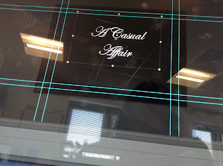
The original design for the title of our "A Casual Affair". We used the name because it was ironic to the plot of the film where the woman cheats on her husband several times and neither of them cope with the situation very well. We wanted to create the essence of a wedding invitation with the curly font to further the irony and decided, with a bit of feedback, that it would be better with a border around it.
The photos above show Chayana and Natasha discussing the best way to create the border to create the effect we wanted. We had to be careful to make sure that the border didn't overpower the font. We kept it on a simple black background to show the evil within both characters whilst they both try to remain the facade of innocence in front of each other.
Audience Feedback: Melissa's 20 year old brother, Joshua.
Melissa asked him is it was clear what we were trying to achieve which replied to saying that it was.


No comments:
Post a Comment